
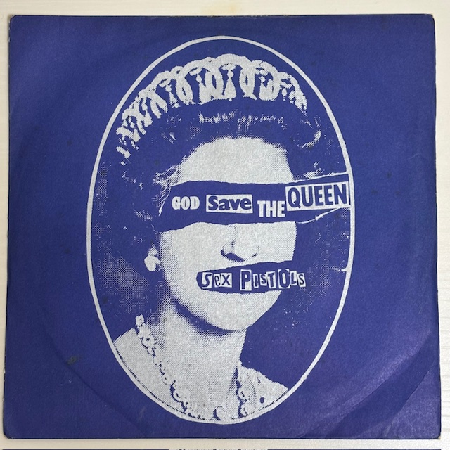
Here We Go!
Back again with another piece from my Sex Pistols collection —
and yep, it’s another copy of God Save The Queen (Virgin VS181)!
This time, I had a few things I was curious about, so I took a closer look 👀
🧷 Sleeve Condition Check
There are some wrinkles and light stains, but considering its age, I’d say it’s in pretty solid shape overall!
🧷 Vinyl Condition
The record itself? No scuffs or hairlines — looks great 👍
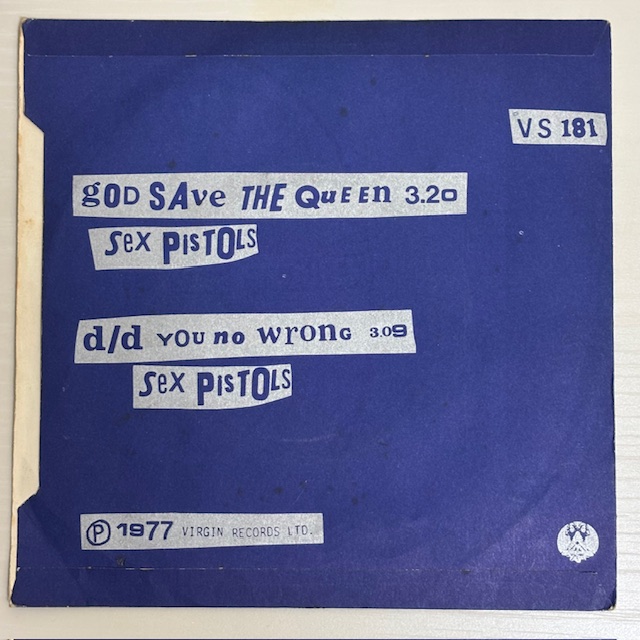
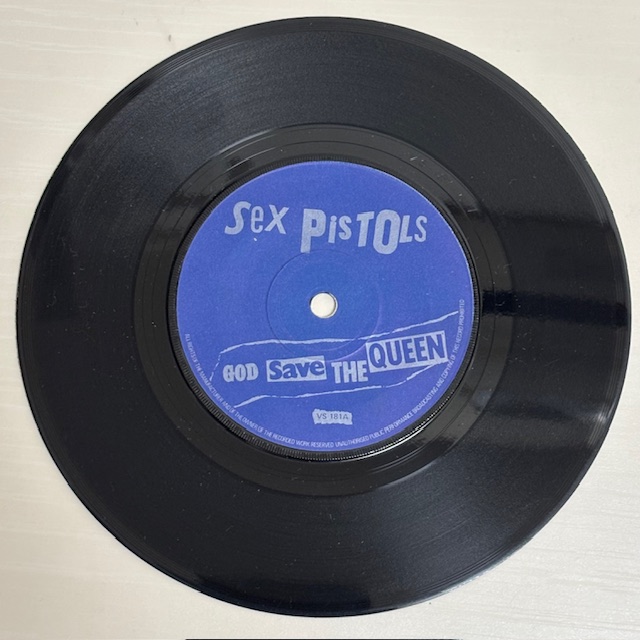
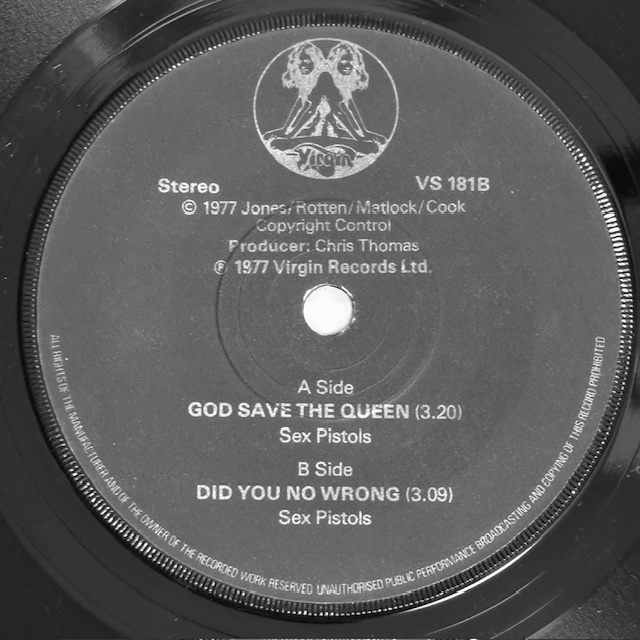
🧷 Matrix Numbers
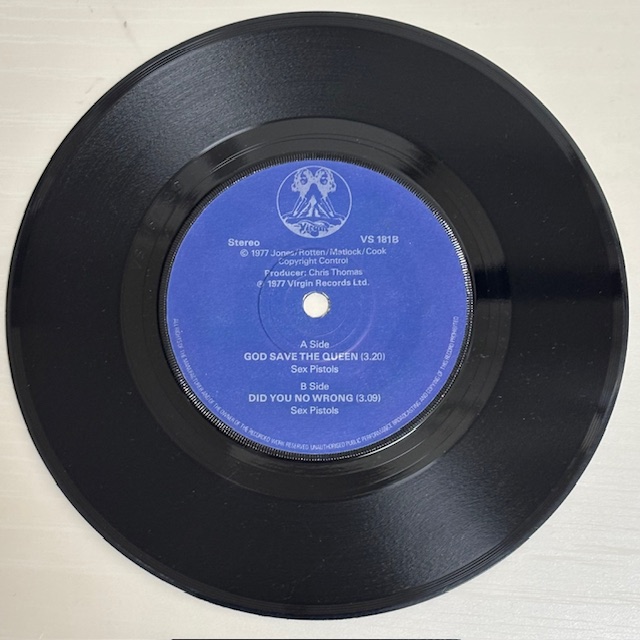
VS-181-A-7 / VS-181-B-5
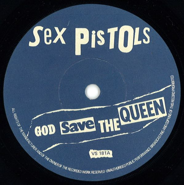
🧷 Now for the main topic: the label text color!
I always thought this was a silver text first pressing —
the label looks kind of silvery at a glance, you know?
But when I checked the matrix again and saw A7 / B5… hold on a second 🤔
That’s more like a 3rd or 4th press matrix, right?
Which would mean it’s actually white text, not silver!?
When I looked it up on Discogs, the white text versions looked clearly white —
(see comparison image below, borrowed from Discogs 🙏)
So I decided to investigate how to properly tell silver from white label text!
💡 Label Text Breakdown
・1st Press: Blue label with silver text on both sides
・2nd Press: Blue label with white text on A-side, silver text on B-side
・3rd Press onward: Blue label with white text on both sides
🧷 How to tell Silver vs White Text(with a little help from ChatGPT too 😆)
After digging around, here’s what I found — some helpful tips for telling them apart:
1. Check under a light source
・Silver text will shine or reflect under light ✨
・White text has a flat, matte look from any angle
→ I tried it, but…
Hmm… kinda shiny? Kinda not? Not sure 🤔
2. Look at the edges of the print
・Silver is usually a foil-like print, so edges can be a little soft or fuzzy
・White is standard ink, so edges look crisp and defined
→ This one does look kind of sharp… maybe?
3. Contrast with the blue label
・Silver text tends to blend in more with the blue background
・White text pops with a stronger contrast
→ Based on contrast… it still kind of leans silver to me?
✅ Final test: Natural light + Black & White photo!
Turns out the most reliable method is this:
・Hold the label under natural light and tilt it
・Take a photo and apply a black-and-white filter
Apparently, this brings out the difference really clearly!
Test results…?
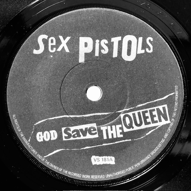
Super crisp and clear — this one’s definitely white text 😅😅😅
So yeah… that Instagram post I made two years ago calling it silver text?
Totally wrong 😅 Sorry about that 🙇♂️🙇♂️🙇♂️
Not sure if it faded over time, or if it was always this way,
but it looks like the white ink aged into a more grayish tone.
A little disappointing, but I’m just glad to finally figure it out 👍
🔜 Coming Next:

Next up is the third single in the Virgin series:
Pretty Vacant — Virgin VS184!
Stay tuned!
byebye 👋


コメント