Here We Go!
Continuing my Sex Pistols collection series —
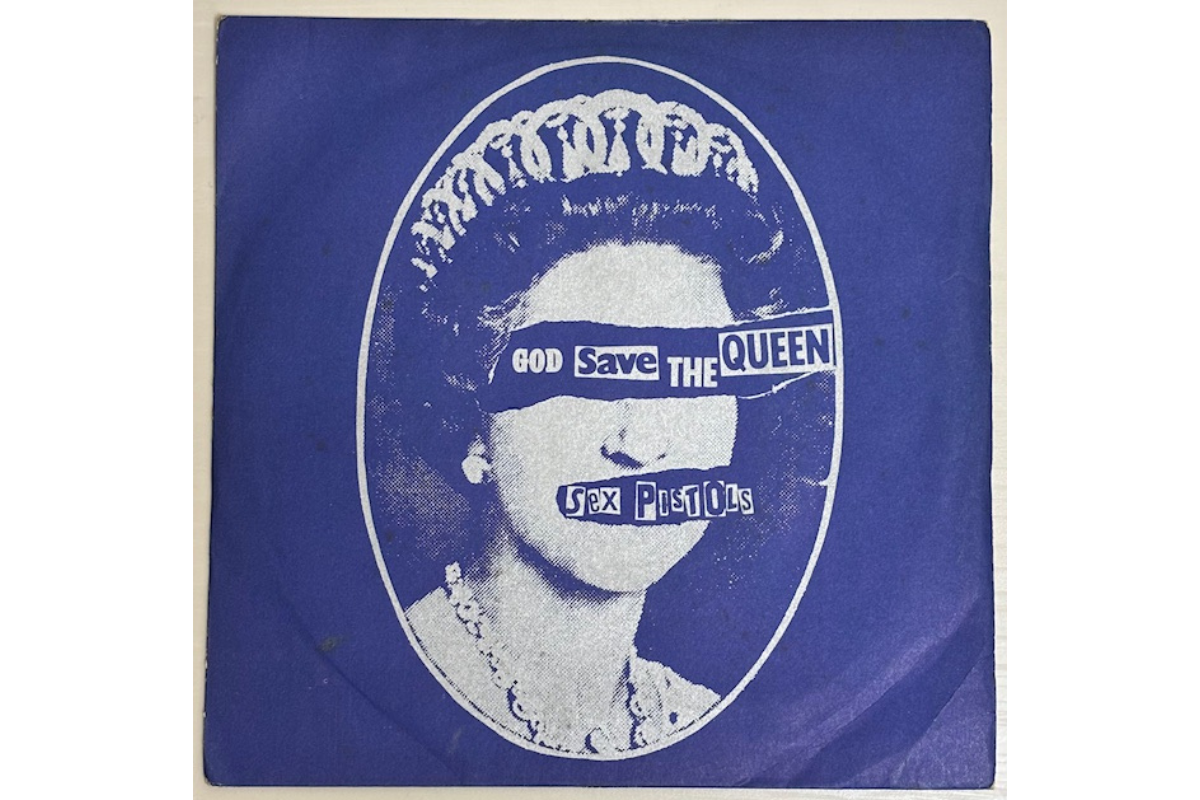
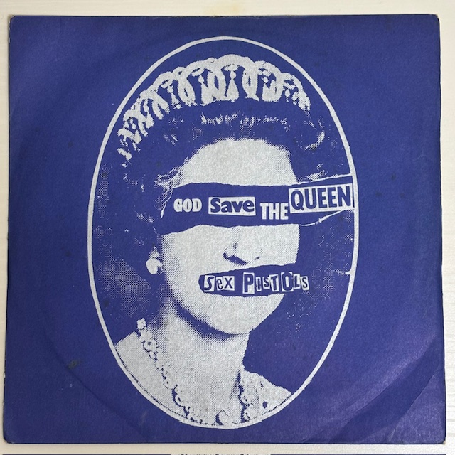
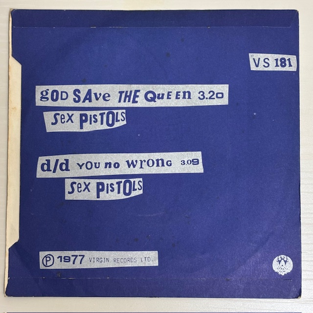
this time featuring another copy of God Save The Queen (VS181).
🔗 If you missed the previous post, I covered the specs of the original UK first pressing in detail.
This article dives into something I’ve been curious about:
a strange case of label colour.
🧷 Sleeve & Vinyl Condition
🧷 Sleeve Condition
Aged, but not bad considering its age. Some wrinkles and staining, but overall decent.
🧷 Vinyl Surface
No visible scuffs or hairlines — looking good! 👍
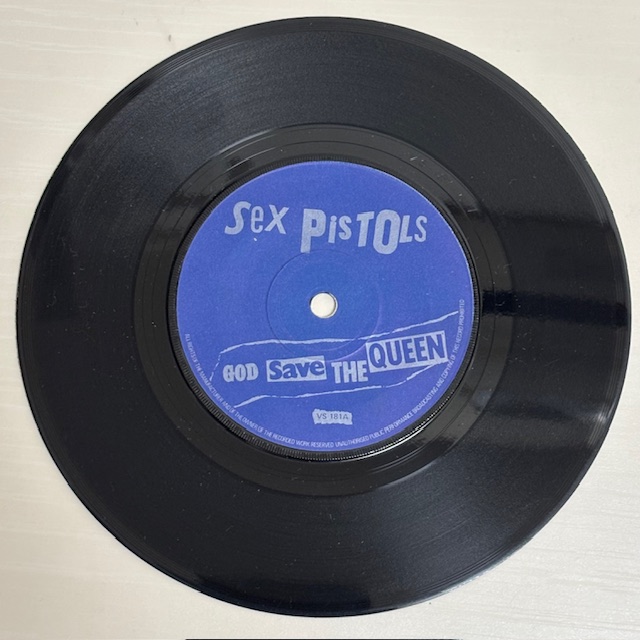
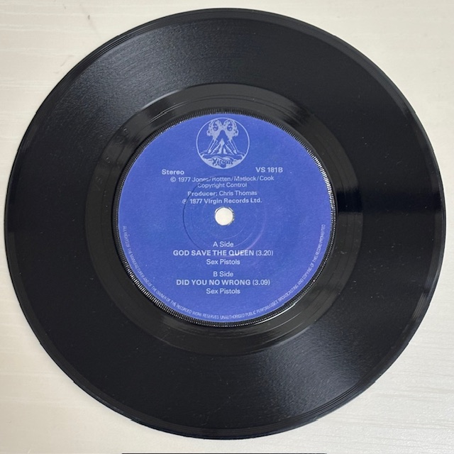
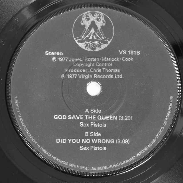
🧷 Matrix Numbers
VS-181-A-7 / VS-181-B-5
🧷 The Main Question: What Colour Is the Text?
I always assumed this copy had silver text — it looks like silver at a glance.
But the matrix reads A7 / B5… which points to a 3rd or 4th pressing.
So, shouldn’t it be white text?
According to Discogs, white labels are fairly obvious.
But mine seemed… somewhere in-between.
So I decided to investigate.
🧷 Label Guide
- 1st Press: Blue label, silver text (both sides)
- 2nd Press: Blue label, white text on A-side, silver on B-side
- 3rd Press & later: Blue label, white text both sides
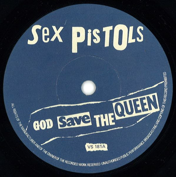
🧷 Silver or White? Here’s What I Found
I even consulted ChatGPT for extra input 😆
After researching and testing, here’s what stood out:
1. Lighting Test
- Silver text reflects light — it shimmers ✨
- White text stays flat and matte, regardless of angle
🧪 Verdict:
Hard to tell. It kind of reflects… or does it? 🤔
2. Edge Detail
- Silver text (hot foil print) = slightly blurred outlines
- White text (standard ink) = sharper, cleaner edges
🧪 Verdict:
Hmm… the letters do look pretty sharp. Leaning white?
3. Contrast Against Blue
- Silver tends to blend into the blue background
- White pops with stronger contrast
🧪 Verdict:
Visually, this still felt more like silver — but maybe not…
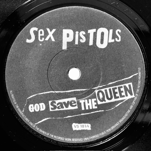
The Most Reliable Method: Natural Light + Monochrome Photo
This seems to be the community’s go-to:
- View in natural daylight
- Take a photo with your phone and apply black-and-white filter
💡 Apparently, this really helps expose subtle differences in ink tone.
So I gave it a go — and…
I was totally wrong when I posted this as “silver text” on Instagram two years ago 😅
📸 Result?
No doubt about it — it’s white.
Crisp, clear, non-reflective. Not silver after all 😅😅😅
So yeah… the “silver print” I posted on Instagram two years ago?
That was a mistake 🙇♂️🙇♂️🙇♂️
Turns out the ink had faded into a greyish hue over time, which threw me off.
A bit of a letdown, but at least now I know — and that’s what counts.
💡 Bonus Nerd Detail
There’s a rare variant believed to have emerged during the transition from silver to white printing.
This so-called “intermediate” label — likely a second press anomaly — used silver-looking ink but with matrix numbers from later pressings (like A7/B5).
Collectors say it’s uncommon, with very limited quantities pressed.
My copy might be one of those. A happy accident of timing.
🔜 Coming Up Next
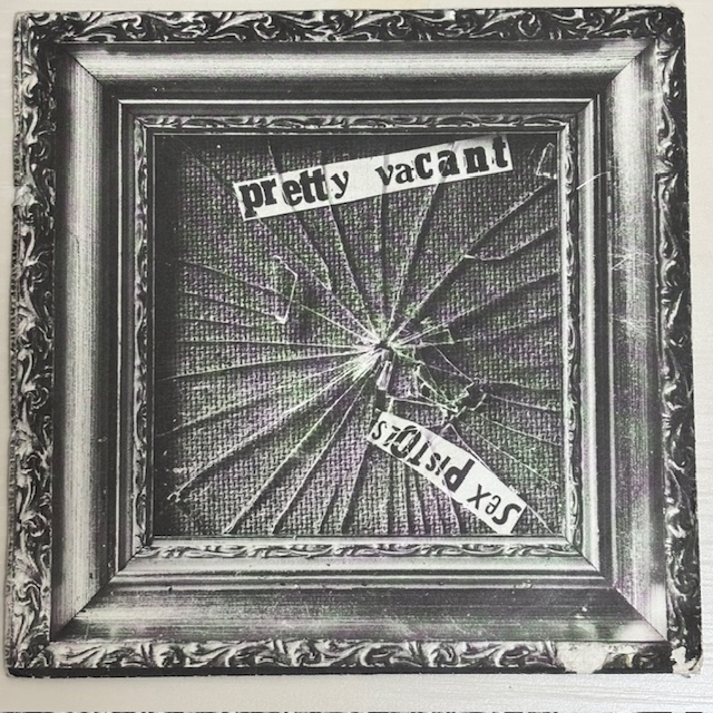
Next time, we’re moving to the third single in the run:
Pretty Vacant – Virgin VS184
Looking forward to sharing that one!
byebye 👋
For collectors interested in Japanese editions
If you are drawn to the design and information found on Japanese releases, particularly obi strips, you may want to take a look at my Never Mind The Bollocks Japanese CD OBI Gallery.
This page organises each obi strip variation issued for the album individually, presenting the obi itself as the main focus in a collector-oriented reference format.
It is intended as an entry point for those interested in Japanese obi strips.

コメント